HealthLink
Project Type
UI/UX
Branding
My role
UI/UX designer
Visual designer
Tools
Figma
Adobe XD
Adobe Illustrator
Contribution
User interview
User persona
Ideation
Prototyping
Wireframing
Logo design
Icon design
Duration
8 weeks

Redesigned the website for HealthLink to address navigation challenges and improve user experience. The original site had cluttered menus and repetitive information, making it difficult for users to understand the company's purpose and locate key details. The redesign introduced a modern, user-centered interface, complemented by a fresh logo, custom icon set, and a comprehensive component library to ensure consistency and scalability.
HealthLink is a cloud-based software (SaaS) platform that helps medical professionals securely store and access sensitive patient information, like test results and files.
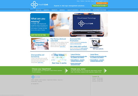
The Challenge:
The previous HealthLink website was confusing to navigate, with cluttered menus and repeated information. This made it difficult for users to understand what HealthLink was for and find the information they needed.
The Goal:
HealthLink wanted a fresh look and a more user-friendly interface to improve user experience and promote their secure medical record storage tool, ViTELflo.
User Research Findings:
Through conducting user interviews, we discovered two key findings.

Difficult Navigation
Users found it difficult to navigate through the
website and find the necessary information.

Lack of Credibility and Reliability
Users found the credibility and reliability of the
company to be questionable as it looked outdated.
Personas:

The Solution:
I redesigned the website, focusing on:
Clarity and organization: Simplifying the navigation, eliminating unnecessary clutter, and presenting information clearly and concisely.
Credibility and trust: Updating the brand with a modern, professional look and feel.
Accessibility: Ensuring the website is accessible to everyone, including people with disabilities.
Mobile-friendliness: Creating a responsive design that works seamlessly on all devices.
Key Features of the New Design:
Color: Created a Monochrome color palette to have a calm and soothing atmosphere.

Typography: Selected the Avenir font for its professional and modern appearance, as well as its readability

Icons: Designed +20 icons to enhance user experience across various services.
Authentic Imagery: Added a personal touch and build trust.

Navigation: Updated navigation to find information easily and efficiently.

Component Library: Created these components through figma and added them to our final web pages.

Banners

Forms

Responsive Design: Designed all the web pages in Figma and they are responsive on all devices, from phones to desktops.

Low-fidelity Wireframe Design:
With Figma, basic wireframes were made to give a visual idea of each layout and to test them before making more detailed designs.

High-fidelity Visual Design:
In our high-fidelity designs, I meticulously crafted detailed visuals to enhance the aesthetics.


The Results:
22%
Reduced Bounce rate
30%
Increased Site Traffic
90%
User Satisfaction Rate
Thanks for Scrolling!