iFinance Portal
My role
Product Design
Contribution
UX research & analysis
Information architecture
User flows & navigation
Interaction & UI design
AI-assisted prototyping
Responsive design
Design system alignment
Stakeholder collaboration
Developer handoff
Duration
16 weeks

Tools
Magic Patterns
Claude
ChatGPT
Figma
Adobe Illustrator
Making financing less complicated, one step at a time.
Financing is complicated enough. Managing it shouldn't be.
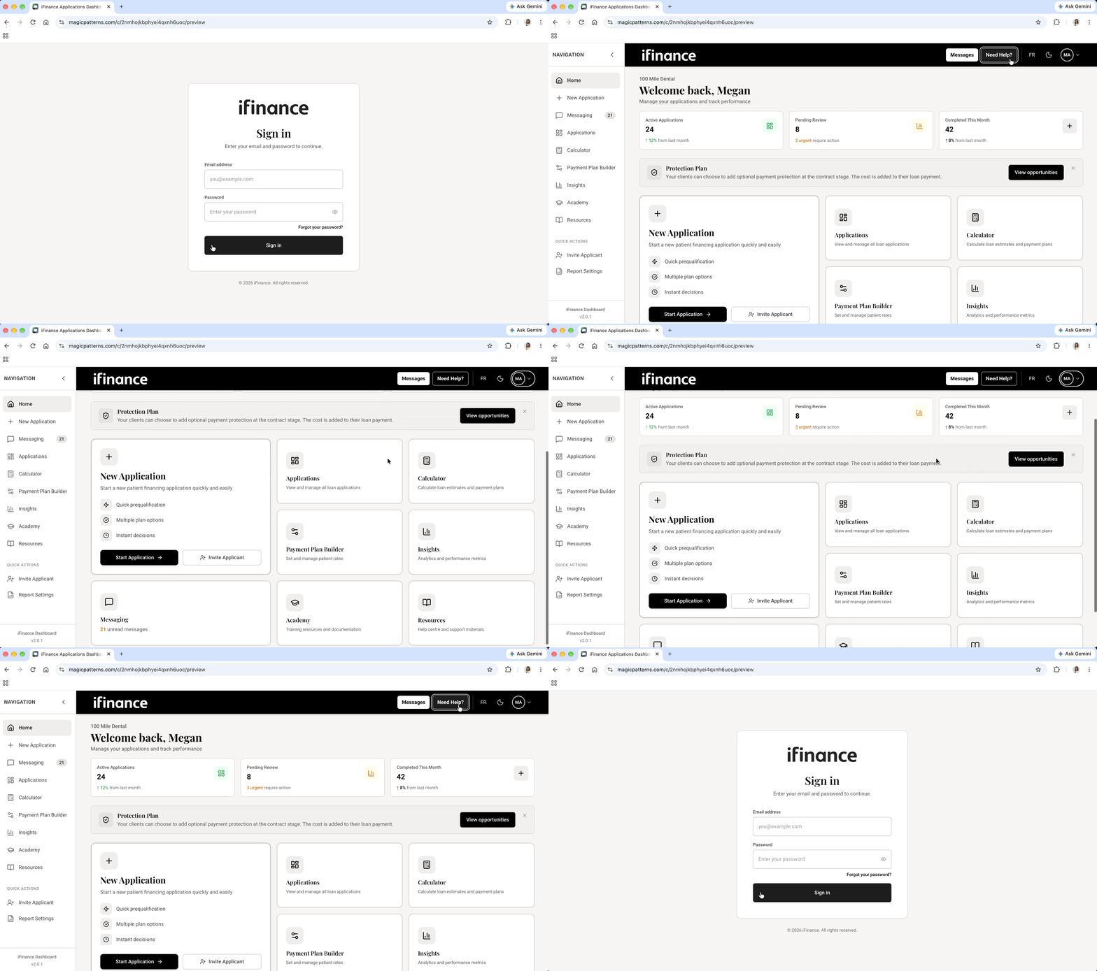
At iFinance Canada, I helped create a merchant portal that brings applications, credit reviews, messaging, payment tools, and reporting into one experience.
The goal? Make everyday financing tasks simpler, faster to navigate, and easier to understand.
The Challenge
Too many moving pieces. Not enough clarity.
Different application stages, confusing actions, multiple tools, user permissions, and two languages. There was a lot to bring together. The challenge wasn't just fitting everything into one dashboard. It was making sure merchants could find what they needed, understand what was happening, and know what to do next.

Understanding the problem
Before connecting the screens, I had to connect the people.
Sales understood merchants' frustrations. Credit knew the financing rules. Product brought business priorities, and developers understood the technical constraints. I worked across these teams, reviewed workflows, and gathered feedback to connect the dots and turn different perspectives into a clearer product experience.

The Design Process
Less guessing. More doing. I focused on three areas:
Making applications easier to follow
I simplified stage cards, improved visual hierarchy, and made key actions easier to recognize.
Making navigation more intuitive.
I organized tools around merchants’ daily tasks, making applications, messages, and reports easier to find.
Making complex rules easier to understand.
I clarified restricted settings, helping merchants understand why certain actions weren’t available.
Using Figma, Magic Patterns, and AI-assisted prototyping, I explored solutions and refined them with stakeholders and developers.
The Solution
Everything merchants need. Without the guesswork.
A responsive merchant portal designed to bring financing workflows together in one organized experience.
Clearer navigation, recognizable actions, consistent components, and a more intuitive way to manage applications across desktop and mobile.


What I Learned
Launch isn't the finish line. It's just the beginning.
This project taught me how much communication matters in product design. Listening to users and different teams, balancing feedback, and finding solutions that work for everyone. Even after launch, the work continues. Through usability testing, feedback, and continuous iteration, we keep refining the merchant portal and making the experience better, one improvement at a time.
Curious to see it in action?
The best way to understand a product is to explore it yourself. Take a look at the iFinance Merchant Portal and see how it all comes together.