Vito App
My role
UX Design
UX Research
Contribution
User interview
User persona
Usability testing
Ideation
Prototyping
Wireframing
Duration
11 weeks

Tools
Figma
Miro
Adobe Illustrator
Adobe Photoshop
Vito – Find the Care You Need, Fast
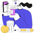
Sometimes, big ideas come from everyday moments. Like the time my roommate, Kim, twisted her ankle during a dance performance. What seemed like a minor injury turned into a full-day ER wait and a vague “just rest” diagnosis. With no family doctor or insurance, she was stuck in pain and confusion and couldn’t even walk to the nearby clinic. I couldn’t stop thinking—there has to be a better way. That moment sparked Vito.

A snapshot from the days that sparked the idea behind Vito.
Project Overview
Vito is a mobile app that helps people find the care they need. Whether it’s a sprain, stress, or something in between, Vito connects users to real, trusted practitioners with just a few taps.
The Problem: Many people don’t know where to start when seeking care—especially without a family doctor, insurance, or clear symptoms. Finding the right practitioner is often slow, confusing, and stressful.
The Goal: Design an app that helps users find trusted care providers—fast. Whether they know what they
need or not, Vito should guide them, offer
options, and make booking easy.
My Role: I led the UX process from research through to the high-fidelity prototype, with Liza supporting research
and testing, and Evan bringing designs to
life through development.

-
Wireframes & prototypes
-
UI design & usability testing
-
User research & interviews
-
Personas & journey mapping
Responsibilities:
Design Thinking Process
Empathize
-
User interviews
-
Pain points
-
Competitor audit
Define
-
User personas
-
User journeys
Ideate
-
Site map
-
User flow
-
Feature planning
Wireframe
-
Prototypes
-
Design iterations
-
Mockups
Test
-
Usability testing
-
Affinity Mapping
-
Feedback iterations

Empathize
Understanding the Users
To uncover user needs and pain points, Liza and I ran a mix of unmoderated interviews, online surveys, and competitive research.
We conducted:
-
5 unmoderated interviews with users aged 25–55 who regularly use wellness or health-related apps
-
20+ survey responses to capture user frustrations and expectations
-
4 competitor audits to explore onboarding flows and booking systems
Key insights:
-
Users are often unsure who to see for a specific problem
-
Many don’t have a family doctor or health card
-
Most prefer a fast, mobile-first experience
-
Virtual appointments are a must, especially for those with mobility issues
These insights helped shape Vito into a simplified, user-friendly, and accessible app.
User Research Pain Points
Too many options,
not enough guidance
Users wanted help identifying their issue first, not just scrolling through lists of specialists.
→ We created a smart AI chat to guide users based on their symptoms.
1
Booking felt slow
and clunky
Users needed to book in a few easy steps, with available times visible upfront.
→ We streamlined the flow to show availability quickly, with options for both virtual and in-person care.
2
Insurance was
a barrier
3
Some users couldn’t find care due to not having insurance or a health card.
→ Vito includes practitioners who serve uninsured users.
Competitive Insights
We looked at four key competitors—Zocdoc, Maple, TELUS Health, and HealthTap—to see what worked well and where there were gaps. Most offer virtual care, but lack intuitive AI support and accessibility features. Zocdoc stood out with its clean user flow, while others felt clunky or unclear. Across the board, transparency and trust were key user expectations. These insights helped shape Vito’s focus on intuitive design, inclusive access, and a friendly AI assistant to guide users from confusion to care.
Here is the link to check out the full table and details about the audit.

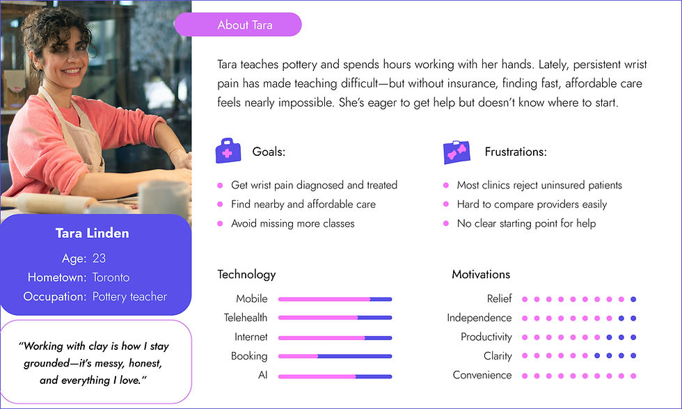
Define
Personas
Before jumping into design, we wanted to get a clear picture of who we were designing for. Based on our interviews and research, we created two personas—Tara and Robert—to bring our users’ stories, needs, and struggles to life. They became our guideposts as we shaped Vito’s features and experience.

User Journey Maps
Tara Linden
Goal: Tara uses the app to quickly find affordable care and get back to teaching pottery pain-free.

Robert Vance
Goal: Robert uses the app to connect with a trusted practitioner and improve his sleep without disrupting his creative routine.

Ideate
Starting the Design
Information Architecture & User Flow
To make sure the app feels easy to navigate, Liza and I started by sketching out a clear sitemap of the main screens. Then, we mapped a user flow to show how someone might move through the app—from opening it to booking an appointment. This helped us stay focused on keeping the experience smooth, especially for users in pain or in a hurry.

User flow
Site map

Future Planning
Once our sitemap and user flow were in place, we started mapping out the must-have features that would make Vito feel simple, clear, and supportive. These ideas came straight from our research and usability goals, focusing on helping people get care without confusion.
-
Smart AI Assistant – guides users in describing their issues and finding the right care.
-
Visit Type Labels – shows if a practitioner offers virtual or in-person appointments.
-
Booking Management – lets users view, edit, or cancel appointments easily.
-
Streamlined Experience – keeps every step, from search to confirmation, quick and stress-free.
Wireframe
Lo-fi Wireframes
Paper wireframes helped us sketch different search and booking flows

Digital wireframes refined those ideas into clear layouts

A low-fidelity interactive prototype was created for testing core functionality — see it here.
Test
Usability Study
We conducted an unmoderated usability test with 5 participants. Each user recorded their screen while completing 4 key tasks in the Lo-fi prototype. They also narrated their thoughts while using the app.
Type
Unmoderated remote test
Participants
5 individuals from target audience
Prototype
Low-fidelity interactive prototype
Tasks
4 core booking and navigation flows
Session Style
Screen recording + think-aloud narration
Goal
Spot usability issues in the booking flow
Liza helped organize our feedback using affinity mapping, and we pulled out the most important action items:

Here are the most important problems we needed to solve after our moderated test:
1. Confusing Calendar Interface & Button Placement
2. No Way to Edit Appointments

2
1
✅ Redesigned the calendar to look more like a familiar paper format, with clearer day selections and better-placed buttons for accessibility.

Users had trouble selecting a date—it didn’t feel intuitive. Having key buttons placed side-by-side also made the flow less accessible.
Users wanted the flexibility to make changes after booking.

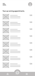
✅ Added a dedicated page where users can view, edit, or cancel their appointments in one place.
3. Unclear Confirmation
Users weren’t always sure if their booking went through.
4. Limited AI Chat Categories
Users felt restricted by the preset symptom categories.
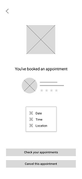


✅ Introduced a confirmation screen with appointment details and a clear success message.
✅ Replaced rigid categories with a general AI assistant that guides the conversation based on user input.
Design
The fun part begins – building the UI Kit
With structure and feedback locked in, we crafted a UI kit that expresses Vito’s personality—colors, typography, illustration style, icons, buttons, and navigation—all enhancing clarity while being warm and approachable.
Brand Logo


Medical Illustrations

Color Palette
Vibrant violet (primary)
Bright pink (secondary)
Warm yellow (tertiary)
Typography
Headline1
Headline2
Body1
Body2

Button Styles
Card Components


App Header

Navigation Bar
Final Design
High-fi Wireframes
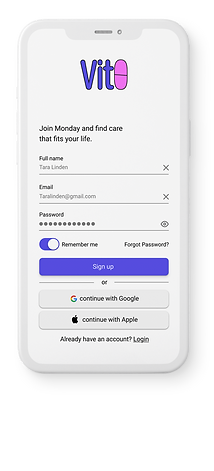
Onboarding & access
We start with the splash screen, followed by friendly onboarding screens that introduce Vito’s value, then provide easy login or signup. The flow feels effortless, human, and accessible.


Home Page
The home page is designed to give users a smooth start, putting essential tools and options right at their fingertips. From quick searches to AI guidance and nearby practitioner recommendations, every element supports a fast and confident path to care.

Search Bar
Quickly find care by condition, procedure, or doctor.
Trending Specialties
Fast access to popular care categories.
Practitioners Near You
Local providers with ratings and reviews for easy decision-making.
AI Chat
Guided help to describe symptoms and get matched with the right care.
Practitioner Pages Overview
The practitioner pages are designed to give users all the information they need to choose the right care provider with confidence. From quick-glance details to in-depth profiles, every element is focused on making the selection and booking process simple and reassuring.


Service Icons
Show if virtual visits are available and if a health card or insurance is required.
Practitioner Info Cards
Name, specialty, rating, and reviews at a glance for quick comparison
Availability & Booking
Choose in-person or virtual, then pick from available dates and times.
Map Integration
See clinic location and directions right from the page.
Detailed Profiles
View education, certifications, and patient reviews for informed decisions.
The rest of the pages
From browsing featured practitioners to exploring detailed practitioner profiles, these screens make it simple for users to find trusted providers and choose the right care.


Accessibility Considerations
From the start, we wanted Vito to be for everyone. That meant designing with accessibility in mind: clear colors and contrast, touch-friendly buttons, and labels that work with assistive tools.
Color & Contrast
1
All text and UI elements meet WCAG guidelines for clear visibility and comfortable reading.
Touch Target
Buttons and interactive areas are sized for easy tapping, even on smaller screens or with limited mobility.
2
Clear Labels
Icons, fields, and buttons are paired with text so every action is clear for all users, including those using assistive tools.
3
Takeaways
Creating Vito taught me the power of human-centered design. A simple moment in real life—watching someone I care about suffer while navigating a broken system—turned into a meaningful design challenge.
Great design starts with listening. Real people’s pain points shaped every screen.
Simplicity matters. From words to buttons, everything should feel intuitive.
Accessibility isn’t optional. Everyone deserves equal access to care.
Feedback is gold. Iterating based on real users made the app better—every time.
What’s Next
-
I will follow the users feedback and make the adjustments as many times as needed to make sure the app is still user friendly.
-
Making the app even more accessible and making sure people with accessible devices can use it easily.
-
Adding more categories to the practitioners section and making the app worldwide not only used in Canada.
Thanks for scrolling!